El Niño
This example demonstrates how to: - Retrieve some interesting data from the Copernicus Climate Data Store (CDS) using earthkit-data - Create three subplots comparing different time steps and add a shared legend
Retrieving the data
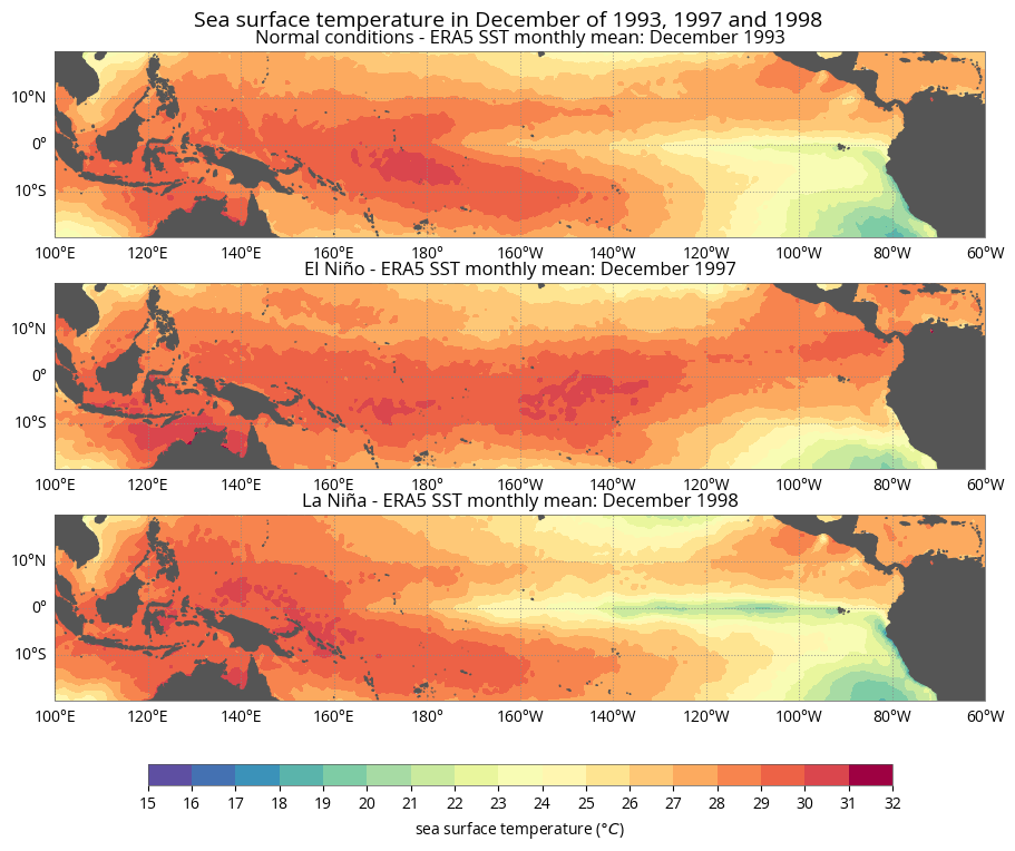
In this example we will visualise how sea surface temperature was affected by the El Niño event of 1997.
[1]:
import earthkit.maps
import earthkit.data
[2]:
YEARS = {
    1993: "Normal conditions",
    1997: "El Niño",
    1998: "La Niña",
}
[3]:
data = earthkit.data.from_source(
    "cds", "reanalysis-era5-single-levels-monthly-means",
    {
        "product_type": "monthly_averaged_reanalysis",
        "variable": "sea_surface_temperature",
        "year": list(YEARS),
        "month": "12",
        "time": "00:00",
        "area": [20, 100, -20, -60],
        "grid": [0.25, 0.25],
    },
)
[4]:
data.ls()
[4]:
| centre | shortName | typeOfLevel | level | dataDate | dataTime | stepRange | dataType | number | gridType | |
|---|---|---|---|---|---|---|---|---|---|---|
| 0 | ecmf | sst | surface | 0 | 19931201 | 0 | 0 | an | 0 | regular_ll |
| 1 | ecmf | sst | surface | 0 | 19971201 | 0 | 0 | an | 0 | regular_ll |
| 2 | ecmf | sst | surface | 0 | 19981201 | 0 | 0 | an | 0 | regular_ll |
Plotting the data
[5]:
style = earthkit.maps.styles.Style(
    colors="Spectral_r",
    levels=range(15, 33),
    units="celsius",
)
[6]:
chart = earthkit.maps.Chart(domain=[100, 300, -20, 20], rows=3)

chart.plot(data, style=style)

chart.land(color="#555", zorder=10)
chart.gridlines(xlocs=range(-180, 180, 20), ylocs=range(-20, 20, 10))

for subplot, conditions in zip(chart, YEARS.values()):
    subplot.title(f"{conditions} - ERA5 {{short_name!u}} monthly mean: {{time:%B %Y}}")

chart.title("{variable_name} in {time:%B} of {time:%Y}", fontsize=14)

chart.legend(label="{variable_name!l} ({units})", ticks=range(15, 33))

chart.show()