1. Getting started with earthkit-maps
Welcome to the earthkit-maps user guide!
earthkit-maps is the geospatial visualisation component of earthkit, a collection of Python libraries designed to simplify the process of accessing, processing and visualising weather and climate science data.
earthkit helps speed up science workflows by providing high-level tools which remove large amounts of the boilerplate code usually required for performing common tasks.
In this introduction, we are going to use earthkit-maps to quickly and conveniently visualise some data on a map. We are also going to make use of earthkit-data to speed up the process of accessing and inspecting some data in common weather and climate science formats (netCDF and GRIB).
If you haven’t used earthkit-data before, you can still follow along with this example - it’s very simple to use!
[1]:
import earthkit.data
import earthkit.maps
We can use earthkit.data.download_example_file() to download some data from a library of sample data. For this first example, we will access some global temperature data from the ERA5 reanalysis dataset, in GRIB format.
[2]:
earthkit.data.download_example_file("era5-2m-temperature-dec-1993.grib")
This file can be easily opened with earthkit.data.from_source().
[3]:
data = earthkit.data.from_source("file", "era5-2m-temperature-dec-1993.grib")
earthkit.maps.quickplot
We can inspect this data in a number of different ways, but perhaps the most straightforward way is to produce a quick automatic visualisation with the handy earthkit.maps.quickplot function:
[4]:
earthkit.maps.quickplot(data)
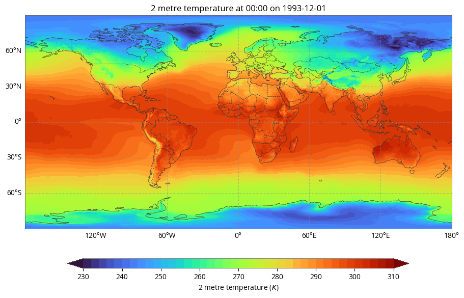
earthkit.maps.quickplot will attempt to find a suitable “style” (colour palette) for the particular data variable you are plotting. It will also attempt to add a legend and a title, formatted with metadata extracted from your source data. These features are format-agnostic - that is to say, they will work the same for different data formats - although note that these depend on your data meeting certain standards, such as CF-conventions for netCDF.
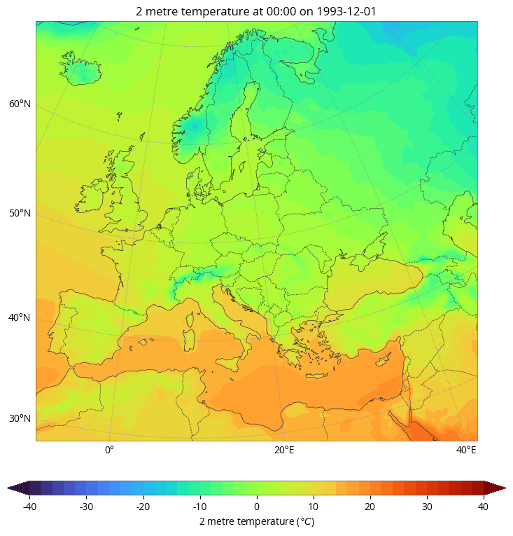
The earthkit.maps.quickplot feature can take some convenient arguments which help speed up taking a quick look at your data - for example, you can pass some desired units or a named domain. We’ll explore these features in more detail in later examples, but here’s a quick look at plotting temperature in celsius over a European domain:
[5]:
earthkit.maps.quickplot(data, units="celsius", domain="Europe")
Charts and Styles
In the above examples we used earthkit.maps.quickplot to produce a quick and convenient visualisation of our data - but what if we want to customise the plot more?
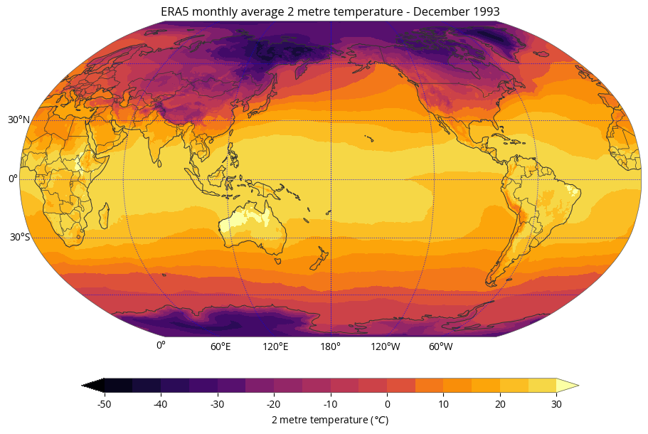
Let’s re-visualise the same data as above with a few additional objectives: - Plot the entire global domain on a Robinson map projection, centred on the International Date Line; - Make the coastlines thicker, make the borders use a solid line, and make the gridlines blue; - Make the title more informative than the automatic default; - Use a perceptually uniform colour palette ranging from -50 to +30 degrees celsius, in steps of 5.
To do all of this, we will need to use two handy classes - the Chart and the Style. A Chart represents the top-level container for all plot elements, whilst the Style represents a colour palette for visualising our data.
Let’s start by creating a Style for our visualisation. It needs: - A perceptually-uniform colour scheme (for example, the “inferno” colour scheme from matplotlib - note that all named matplotlib colour schemes are compatible with earthkit-maps); - Levels ranging from -50 to +30 in steps of 5 (i.e. range(-50, 31, 5)); - Units of "celsius"; - For good measure, we can also extend the range of the palette to
catch any values which are lower than -50 or greater than 30 - we do this with the argument extend="both".
[6]:
style = earthkit.maps.Style(
    colors="inferno",
    levels=range(-50, 31, 5),
    units="celsius",
    extend="both",
)
Now we have a style and some data, we need a Chart to plot it on. Remember, this chart needs to: - Be on a Robinson map projection centred on 180°E, for which we will use a handy cartopy CRS object; - Use the Style we defined above; - Have thicker-than-usual coastlines (the default is 0.5), solid borders and blue gridlines; - Have an improved title, for which we can use metadata-detecting format keys
in our title strings. The sample data we’re using in this tutorial is a monthly average from the ERA5 dataset, so let’s make that clear in the title, alongside the variable name and the month being shown.
[7]:
# Create a Robinson CRS (Coordinate Reference System) centred on 180°E
import cartopy.crs as ccrs  # the source of our Robinson projection
crs = ccrs.Robinson(central_longitude=180)

# Create our Chart using the Robinson CRS defined above
chart = earthkit.maps.Chart(crs=crs)

# Plot the data using the Style we created earlier
chart.plot(data, style=style)

# Add thicker-than-usual coastlines, solid borders and blue gridlines
chart.coastlines(linewidth=0.75)
chart.borders(linestyle="solid")
chart.gridlines(color="blue")

# Add a title using format strings which detect metadata
# Note that times can be formatted using standard datetime format codes - in
# this case the long month name (%B) and the year (%Y)
chart.subplot_titles("ERA5 monthly average {variable_name} - {time:%B %Y}")

chart.legend()

chart.show()